How do you make a Gif Accessible?

How do you make a Gif Accessible? The question came up after I sent off a Gif of some teenage Caucasian boys flashing gang signs in a wannabe fashion. I am always amazed at the world’s Gif library and do wonder what later generations will think of it and us. But I had to ask myself how would I make a Gif accessible? 

I was recently introduced to Haben Girma’s newly released book; Haben: The Deafblind Woman Who Conquered Harvard Law. I’ve been supporting the NYC DOE with the accessibility mandates to comply with the Civil Rights Office Agreement Case Number 02-16-1175. This has provoked me to start asking questions about accessibility and changing my habits. I’ve admittedly found the official rules a bit difficult to decipher. And if you ask one person involved with accessibility another person will have a different answer. Thankfully there’s a plan to untangle some of these rules and questions about them. We currently use the W3C's Web Content Accessibility Guidelines (WCAG). We will be moving toward Silver Standards, “not a bullet but a level”. Silver is aimed to standardize things much more succinctly so we can all be on the same page. 

For me questions still come up. Admittedly earlier in the week I had to google how to make an emoji accessible. I wanted to write 😉 which is semi-colon parentheses, ;). I wondered if a screen reader would read it as “winky face”. It was a hit and miss depending on what screen reader and how the emoji was created. So I googled how to make it more accessible. For one thing we describe emoji’s when we are trying to be accessible. So the pink heart is “pink heart”. And smiley face is “smiley face”. And poop is “chocolate ice cream”. Okay. Fine. It’s “poop”. But we can add these details through a particular accessibility comment in the HTML called Aria aria-label=“poop” in the tag of the emoji would make the screen reader say “poop”. If you have a screen reader installed here’s your chance to make your computer say “poop” 💩

But back to the Gifs. How do we make something so culturally relevant accessible? Videos have closed captioning and images have alt text. A Gif is somewhere between. (I’m going to also need to test if the screen reader says “jif” or “gif”) but just like images they need descriptions. Alt text will allow you to provide a description. Well that was a simple answer to a curious question. 

But wait! Gifs are not inherently accessible!

Gifs loop and have a frame rate which could create a blink in the range of less that 3 times a second which is known to produce seizures. They can be distracting because they go on forever and auto start. You can't stop them since they have no controls. So how do you correct this? The easiest way is to make it a movie. I groaned when I read this. Because I include Gifs in my training slides frequently because they just repeat without the user having to press play. I do want to rebel here but I recognize I would just be disenfranchising millions of people from accessing my materials. If it’s between aesthetics to avoid the cultural shift of clicking play and keeping knowledge from many who need and want it…? Let’s shift our culture. I can’t promise I’ll never use another Gif (and there are ways to make them loop no more that 5 times) but I’ll aim to provide videos with controls stating there is no audio and users should click play along with providing alt text. 


Google App Maker


Andrew Stillman of AmplifiedIT took some time to run through an overview of Google's App Maker. If your are looking to dig in here's Developer documentation.

Andrew Stillman bearded speaking in to a mic held by a hand as he types on a laptop.
First lets go over what it's not:
  • A replacement for the Forms to Sheets workflow. App Maker works with a login on the domain. So a public facing App is not a thing here. A Form would be a better choice to collect things like Parent Emails. 
  • A Mobile App maker. My instinct when I hear App is a mobile solution. This is geared to Web app workflows.
  • A no code solution. As slick as it is with drag and drop, autocomplete and GUI it does require knowledge of coding. Specifically HTML, CSS, Javascript and by extension Google Apps Script. 
  • App Maker is similar in ways to Access, or FileMaker Pro. You can work with related data tables and events. 
  • The data can be organized and displayed by user type in some really slick looking Googley ways. 
  • It's a Low code environment so can be worked with by anyone with some computational skills. 
  • Integrates with the G-Suite system through coding including the directory to provide a level of security to the data being worked with. 


But what it is an can be makes it powerful for any environment with a lot of data flow and systems management.


App Maker allows the creation of some really great workflows and automations. SignUps, Permission Slips, Admissions, Book Reports and more become a customizable operation. These things can be developed or even better reach out to AmplifiedIT to develop it for you or just walk you through the process.

Andrew said it best, "Sheets and Forms have gotten us this far but App Maker is the next step." We all have those systems we are trying to improve, simplify or automate. App Maker makes this a real possibility without having to shell out the funds for software. It's collaborative and relatively inexpensive. $15 gets you started on the low end for a GoogleCloud account and gives you a change to play. From there your creations can scale up for various environments. I'm excited to explore more and create some better workflows.

Check out the
App Maker Bootcamp


Slide Object Order: a new Add-on for Slides


Demonstration of object layer ordering in Google Slides using the Add-on Slide Object Order

In today’s point and click, touch or voice activated world we often disregard the importance of tab order. Tab order allows us to use the keyboard to move from screen element to screen element. It’s most frequently used in data entry positions where speed is a factor. But what if you had to rely on tab order for daily access to content? Some folks with various impairments do. 

Often when we think of accessibility we relate it to society members who have grown up with some impairment. While this is an area of accessibility needs it’s not every case. If you struggle to put a user of this technology in mind I suggest thinking of someone aging in your life who may be hard of hearing or struggling with sight. Users of accessibility tools don’t need to have been born with an impairment. In fact if we were to make everything accessible we’d all benefit. Those wheelchair ramps help us also push strollers and carts easier. 

Some Accessibility features rely on the tab order for navigation. If you use a screen reader you would tab through elements to hear them read. Switches use the same sort of feature tabbing until the item you want to access is highlighted and then accepting the highlight. Technology makes many things which were out of reach to some accessible. But we can still do better. 

While working in a Google Slide deck regarding accessibility, myself and Earnest Poole, @eapoole http://www.themindfulstemteacher.com identified that we could not easily change the tab order of elements. First, the tab order on a slide is attached to the layers of objects, z-index, the further back the earlier the tabbing experience. The z-index is an integer determining the back-to-front layers of digital items. We always have a first or back image. The furthest back image is always a z-index of 0. As we add elements the z-index increases. We theoretically can add an infinite amount of objects but will always have a starting point of 0. 

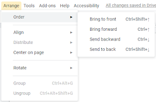
How does this play out when creating a slide deck? Well most of us use z-index to layer images on top of each other. It’s a visual effect which can create appealing slides. We have four choices when working with objects in a slide. 
Arrange Order Menu from Google Slides

  1. Move an object to the furthest front area or z-index of ∞; “Send to front”
  2. Move an object forward one z-index; “Bring forward”
  3. Move an object back one z-index; “Send backward”
  4. Move an object to the furthest back area or z-index of 0; “Send to back”

What we don’t see is the order position each element is currently in. If we move them so they are overlapping we can get a sense of the order. We could also see it by tabbing through them. But there’s no way to see the order for a laid out slide. Until now… 

As Ernest and I were talking about the order of elements on a slide it became obvious we needed an Add-on to help us with what we were doing. We are building a number of slide decks around accessibility and want to be able to walk-the-walk. We needed a tool to not just show us the layers but also allow us to more easily manipulate them. For this I’ve created the Add-on Slide Object Order.
Slide Object Order icon

This sidebar Add-on will display the objects on a slide as an abstract with each object stacked on top of each other. The bottom of the stack would be the first of the tab order. Order numbers are listed to the left to better identify the tab order. Each listing can be dragged to reorder the layer and tabbing on the slide. The change in order on the sidebar automatically updates the slide. 

While exploring this issue and creating a solution we identified a need for the tab order not linked to the z-index arrangement of elements. It’s currently not an option because it would be a fully different integrated system to what is already in place. It would require programmers to build a new layer of things to the Slides platform. It’s a real need if we are going to make things truly accessible to all. Why break up the z-index and the tab order? Let’s say you create a shape an put it on your slide, maybe a rectangle. And then you put your photo on top of the rectangle. The first element tabbed to will be the rectangle you created and then your photo. To get your photo as the first thing tabbed to you would have to change to z-index to less than the rectangle putting your photo behind the shape. The more effective but lesser known trick would be to group the photo and the shape. This would then link them together with the same tabbing/z-index. 

We need tools for creating proper accessibility. No one wants to be left out. When I think about accessibility in the classroom I’m not just thinking about my students but also about the people that care for them. That primary care giver who is a grandparent with cataracts and needs a screen reader to tab through and hear the material they are supporting their student's understanding of. We all benefit when things are accessible. And if we can make accessibility tools more accessible we need to do so. 


Project Based Learning with Daily Tracking

Gif of forms to a maze game development

How do you capture the day to day tracking of project based learning? What even is project based learning are why would I do it?

Let’s face it. A high stakes test to measure the education level of our students doesn’t tell us everything. Our students are trained to take these tests to make us look good. Much of the material on these tests will only later be used in Pub Quizzes. And if you played the game of school well you were always a sought after teammate.

But what about real world day to day skills? Are our students really interested in learning those facts for the test just to learn them? At the heart of project based learning is the “Why?”. Why are we learning this? The learning is the central focal point to get to complete a meaningful project. The why can easily be answered by students when the project is meaningful to them. ie Why are we studying fluid dynamics? Because we're building a sailboat.

We can also think beyond a project and aim for a problem with no easy answer. Large global problems are great but we also need to identify realistic scopes with our students. If we were to solve global warming we'll need to work with students to identify if we were going to tackle it for a class, a school, a community and so forth. What level is reasonable? You and your class my find you can reach further than you anticipated.

Students learn best when they are engaged, and interested in what they are working on. Project based learning identifies a big project or problem to work on from various subject areas. It's not a single classroom methodology. It can work this way and has been done but it's not the most effective. Ideally the problem or project is looked at from various content areas to provide knowledge and information. Sometimes it's the most unlikely sources which inspire innovative changes. The more collaborative a team of educators are in discussing their student's experience the more effective project based learning can be.

What would this look like? Here's a sketch of an idea. Students are tasked with some project. Let’s suggest they are going to develop a self sustaining food source for the entire school. Students then focus various subjects into exploring the problem and executing solutions. Literacy can revolve around non-fiction text about self sustained farming. Throw in a chapter book in which the protagonist has to survive in some environment. History topics can stay on track with the aligned time period with a lens always over-hanging asking where did they get their food from? Science is easily brought in from physics through chemistry and biology. Math is necessary for creation and measurements. Arts provide aesthetics and get the creative parts functioning. Physical education can be far more about the physical doing (ever moved a bunch of dirt?).

But how do we track the work done day-to-day? It's not the end product describing the learning that happened it's the process that came before. The successes and failures are to be celebrated equally. The reflection on what has happened and recognition of self contribution is the greatest reward. So shouldn't we capture everything for later review?

I've previously captured student work using two forms. One for when they enter the class. I used it to focus them on the task ahead. and one when they exit class to capture what they did and when they intend to do. In order to further support this daily capturing I created some code that will combine the two forms so I can look at a student's daily efforts. I also created a way to send the captured information to individual students. They become the creators and owners of their data and progress. Students can look at what they have done and reflect on the process. It's key in the forms to have balanced questions so they align vertically when read on a spreadsheet. The exit form has one extra question capturing a photo or screenshot of what was done for the day.

You can access the materials for yourself here. Make a copy of the Forms and the Log file and place it in a folder of your choosing. Besure your forms are linked to the spreadsheet appropriately and you should be good to go.

When working this way the educator becomes the facilitator. they are no longer the only person in the room with the answers students are expected to work to solve problems on their own. The educator is there to support and direct learning. I've experienced a need to collect formative feedback while facilitating. To do this I created a drop down menu which feeds a spreadsheet I can monitor. You can see and modify the sample called Demo. The Spreadsheet key in the Tools>Script editor section will need to be modified for a spreadsheet you have edit rights on or simply one you make for yourself.

The code in these documents is fully modifiable by you. I've left some comments to help in understanding what it does. I do hope it helps someone in the coming school year. You can access the Google Apps Script Code by going to the Tools menu at the top and selecting Script editor. 

Social Emotional Well-Being During Online Teaching and Learning

The world is a bit nutty right now because of the COVID-19 pandemic. Schools are switching to online learning and parents are working from...